Shelly Beauty
An all-natural hair care beauty line for all types of beautiful.
Category: Rebranding, Strategy, Packaging
Details: Completed in 2021, Freelance
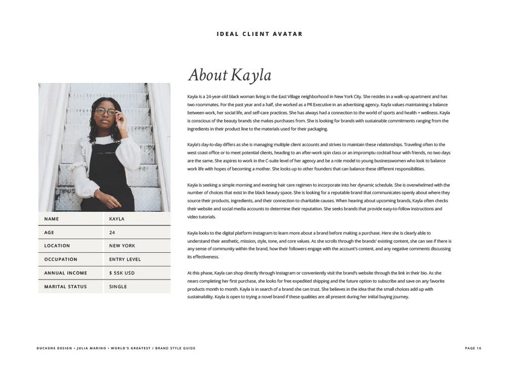
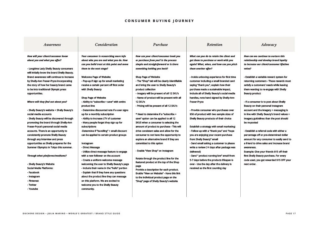
Olympian gold medalist Shelly-Ann Fraser-Pryce, Founder and CEO of Shelly Beauty (formerly known as Lady Shelly Beauty) approached me with the goal of elevating her current brand. Shelly felt like she outgrew her current brand identity. Her wish was for the brand to feel more elevated, timeless and approachable and appealing to not only her Jamaican market, but also to the US, UK, and European markets.
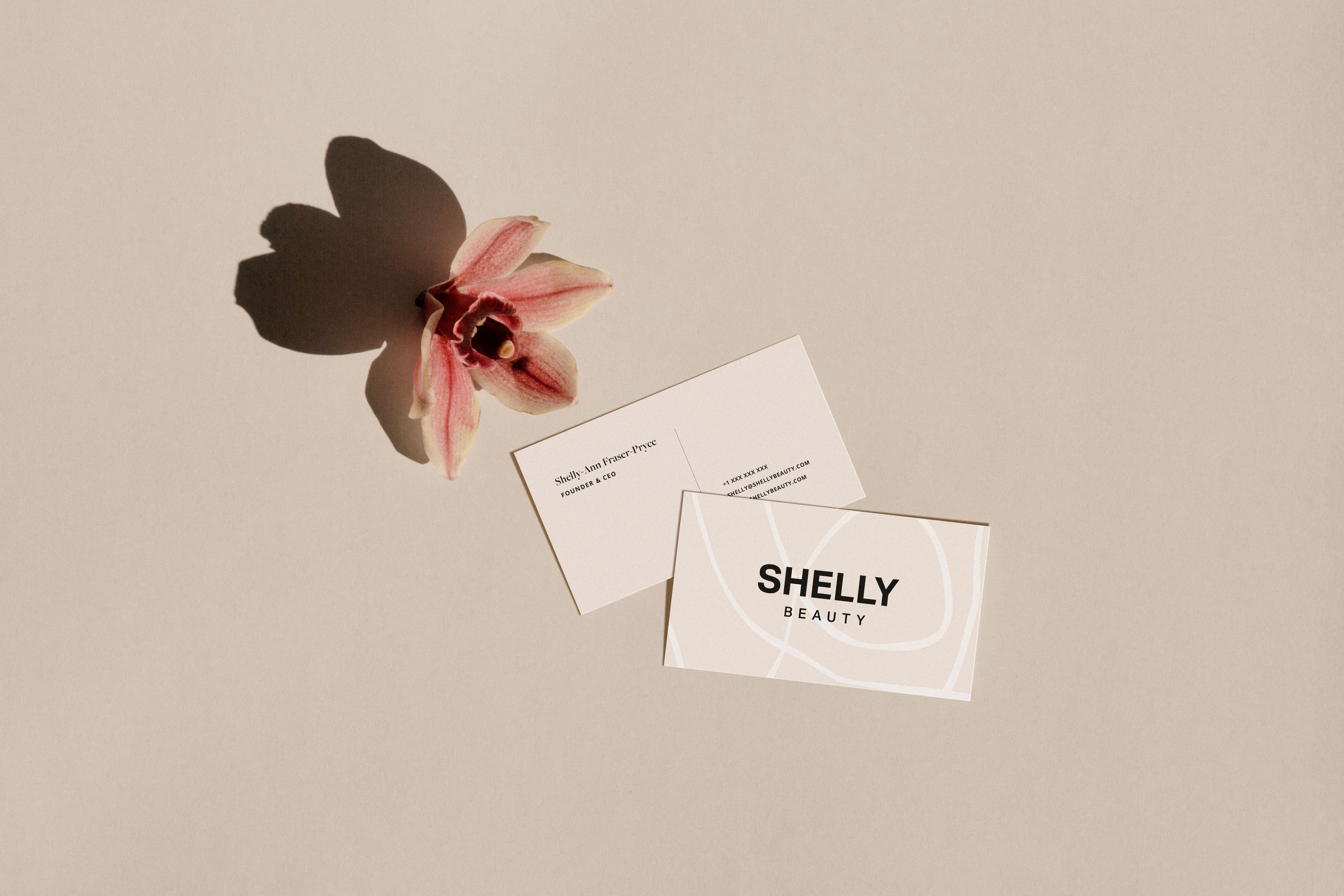
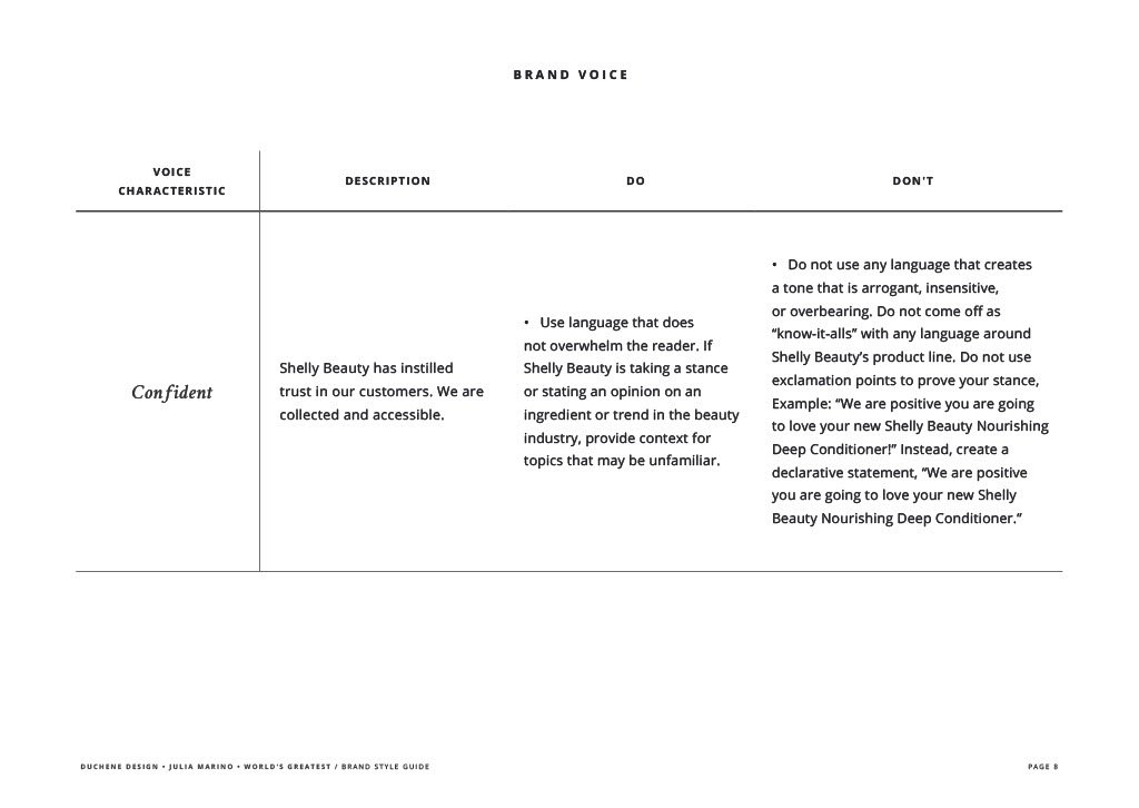
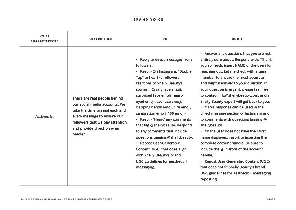
For the Shelly Beauty brand, a few important themes arose: management of curly hair, natural and homegrown ingredients, confidence, and a sense of community. With the rebrand, I wanted to embody those 3 themes in the new visual identity.
The overall rebrand is heavily influenced on two aspects: Shelly-Ann as a person and where she is from, and the organic nature of homegrown ingredients.
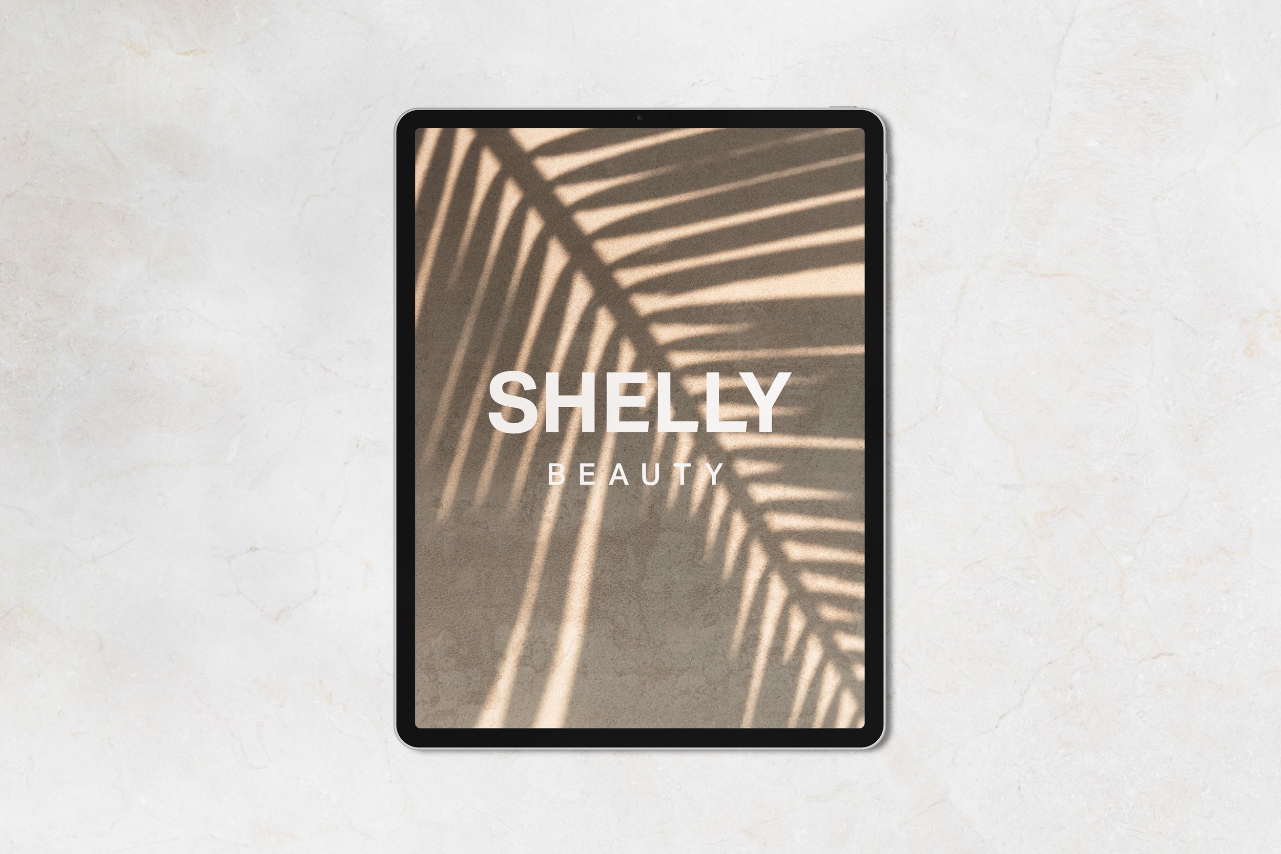
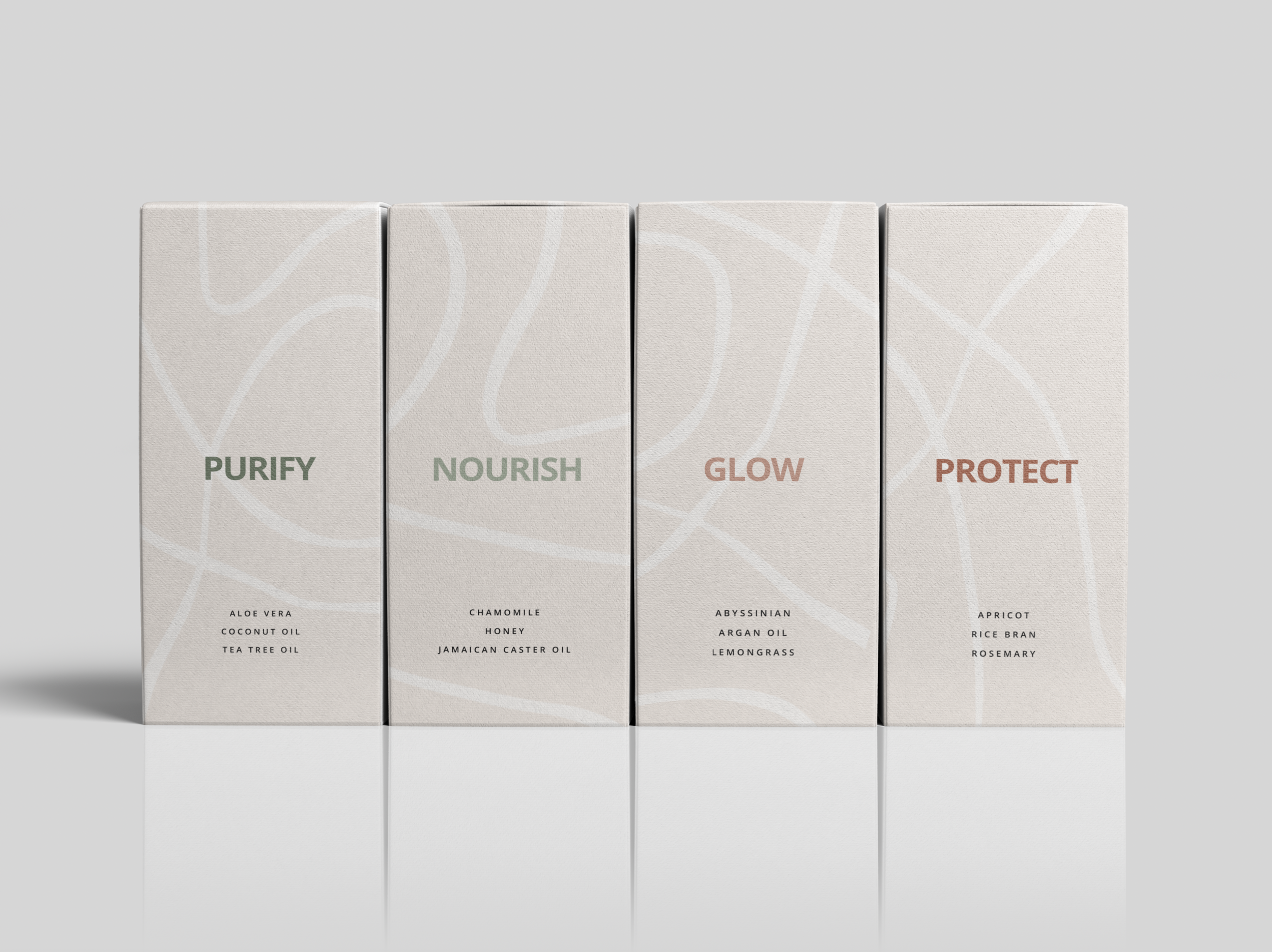
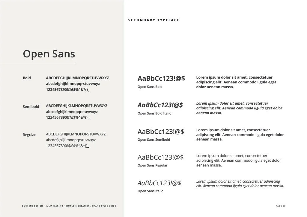
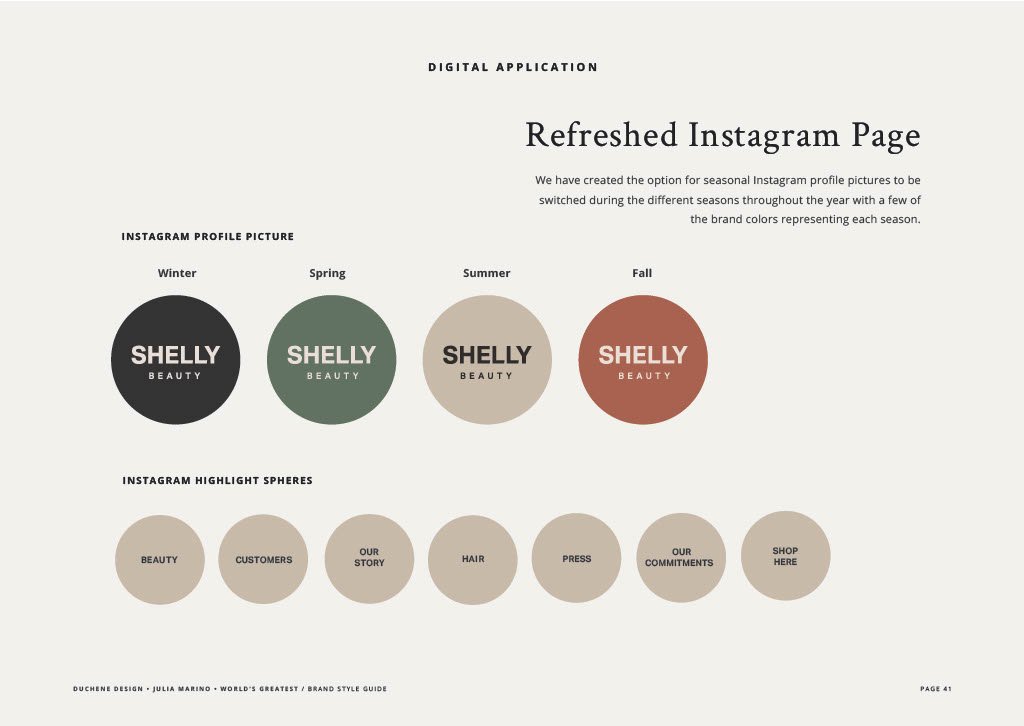
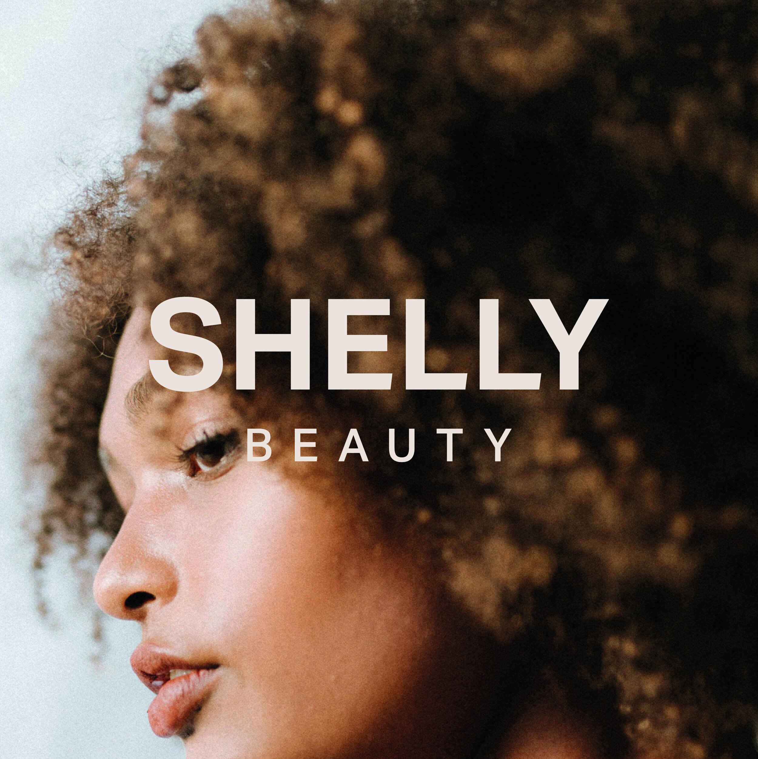
Logo concepts: For the primary and secondary logos, I went ahead with a text-based logo to achieve the elevated and minimalistic look we were going for. I went ahead with a nice sans-serif font and played around with the contrast of the kerning and font weight for the words “Shelly” and “Beauty” on top of each other to give this simple, yet bold and timeless look and feel. The logo was created with the idea it could be used easily and effectively in print, digital and packaging forms. The logos work in unison when using the brand colors contrasted together.
Colors: Shelly-Ann Fraser-Pryce was born and raised in Jamaica. This was an important fact I kept in mind while building the brand look and feel. With the color palette, I went ahead with earthy and organic tones to portray the organic aspect of the homegrown ingredients for the products and the warmth of Jamaica and Shelly’s personality. Using some taupes, forest green, and terracotta as the main color elements. The color scheme has some nice contrasts with rich, earthy tones balanced with some calming, neutral colors.
Pattern: The wavy, free flowing pattern I developed was inspired from the theme of managing wavy hair. The hand-drawn abstract wavy lines work as a signature to the brand and can be used digitally and printed on packaging.
